
In the previous part of this series, we introduced the Nesher Bari project, which aims to build an ML solution to accelerate vulture conservation (see more details in Wildlife.ai’s website). In this post, we dive into more technical details and explore one of the main datasets in the project: the Ornitela dataset.
import libraries
1
2
3
4
5
6
7
8
9
10
11
12
import os
import pandas as pd
import matplotlib.pyplot as plt
import seaborn as sns
from jupyterthemes import jtplot

COLORS = sns.color_palette("deep", 12).as_hex()
pd.set_option('display.max_columns', 100)

darkmode_on = True
if darkmode_on:
    jtplot.style(theme='grade3', ticks=True, grid=True)
Load & Extract Data: Quick Overview
1
2
df_ornitela_raw = pd.read_csv('./../data/Ornitela_Vultures_Gyps_fulvus_TAU_UCLA_Israel_newer.csv')
df_ornitela_raw.head()
| event-id | visible | timestamp | location-long | location-lat | acceleration-raw-x | acceleration-raw-y | acceleration-raw-z | bar:barometric-height | battery-charge-percent | battery-charging-current | external-temperature | gps:hdop | gps:satellite-count | gps-time-to-fix | ground-speed | heading | height-above-msl | import-marked-outlier | gls:light-level | mag:magnetic-field-raw-x | mag:magnetic-field-raw-y | mag:magnetic-field-raw-z | orn:transmission-protocol | tag-voltage | sensor-type | individual-taxon-canonical-name | tag-local-identifier | individual-local-identifier | study-name | |
|---|---|---|---|---|---|---|---|---|---|---|---|---|---|---|---|---|---|---|---|---|---|---|---|---|---|---|---|---|---|---|
| 0 | 16422103004 | True | 2020-08-28 04:27:58.000 | 35.013573 | 32.753487 | -65.0 | 10.0 | -1058.0 | 0.0 | 92 | 0.0 | 28.0 | 1.7 | 5 | 159.69 | 0.277778 | 87.0 | 368.0 | False | 1046.0 | -0.621 | 0.036 | 0.014 | GPRS | 4100.0 | gps | Gyps fulvus | 202382 | T59w | Ornitela_Vultures_Gyps_fulvus_TAU_UCLA_Israel |
| 1 | 16422103005 | True | 2020-08-28 04:30:33.000 | 35.013290 | 32.753368 | -33.0 | -638.0 | 815.0 | 0.0 | 92 | 15.0 | 28.0 | 1.7 | 5 | 16.04 | 0.277778 | 47.0 | 368.0 | False | 1386.0 | -0.603 | -0.330 | -0.495 | GPRS | 4103.0 | gps | Gyps fulvus | 202382 | T59w | Ornitela_Vultures_Gyps_fulvus_TAU_UCLA_Israel |
| 2 | 16422103006 | True | 2020-08-28 04:35:28.000 | 35.013302 | 32.753448 | -17.0 | -635.0 | 824.0 | 0.0 | 93 | 15.0 | 29.0 | 1.8 | 5 | 11.44 | 0.000000 | 113.0 | 368.0 | False | 2047.0 | -0.575 | -0.367 | -0.493 | GPRS | 4108.0 | gps | Gyps fulvus | 202382 | T59w | Ornitela_Vultures_Gyps_fulvus_TAU_UCLA_Israel |
| 3 | 16422103007 | True | 2020-08-28 04:40:28.000 | 35.013493 | 32.753475 | 108.0 | 4.0 | 1044.0 | 0.0 | 93 | 0.0 | 31.0 | 1.8 | 5 | 11.53 | 0.000000 | 52.0 | 368.0 | False | 1928.0 | 0.040 | -0.045 | -0.659 | GPRS | 4108.0 | gps | Gyps fulvus | 202382 | T59w | Ornitela_Vultures_Gyps_fulvus_TAU_UCLA_Israel |
| 4 | 16422103008 | True | 2020-08-28 04:45:37.000 | 35.013519 | 32.753521 | 60.0 | -432.0 | -1147.0 | 0.0 | 93 | 0.0 | 31.0 | 2.0 | 4 | 20.52 | 0.277778 | 290.0 | 368.0 | False | 496.0 | -0.314 | 0.111 | -0.113 | GPRS | 4106.0 | gps | Gyps fulvus | 202382 | T59w | Ornitela_Vultures_Gyps_fulvus_TAU_UCLA_Israel |
Let’s explore some basic information about the Ornitela dataset, mainly shape and schema:
1
print(f" n_rows: {df_ornitela_raw.shape[0]} \n n_columns: {df_ornitela_raw.shape[-1]}")
1
2
 n_rows: 2374007
 n_columns: 30
1
2
3
print(f"dataset schema:")
print("="*60)
df_ornitela_raw.info()
1
2
3
4
5
6
7
8
9
10
11
12
13
14
15
16
17
18
19
20
21
22
23
24
25
26
27
28
29
30
31
32
33
34
35
36
37
38
39
dataset schema:
============================================================
<class 'pandas.core.frame.DataFrame'>
RangeIndex: 2374007 entries, 0 to 2374006
Data columns (total 30 columns):
 #   Column                           Dtype
---  ------                           -----
 0   event-id                         int64
 1   visible                          bool
 2   timestamp                        object
 3   location-long                    float64
 4   location-lat                     float64
 5   acceleration-raw-x               float64
 6   acceleration-raw-y               float64
 7   acceleration-raw-z               float64
 8   bar:barometric-height            float64
 9   battery-charge-percent           int64
 10  battery-charging-current         float64
 11  external-temperature             float64
 12  gps:hdop                         float64
 13  gps:satellite-count              int64
 14  gps-time-to-fix                  float64
 15  ground-speed                     float64
 16  heading                          float64
 17  height-above-msl                 float64
 18  import-marked-outlier            bool
 19  gls:light-level                  float64
 20  mag:magnetic-field-raw-x         float64
 21  mag:magnetic-field-raw-y         float64
 22  mag:magnetic-field-raw-z         float64
 23  orn:transmission-protocol        object
 24  tag-voltage                      float64
 25  sensor-type                      object
 26  individual-taxon-canonical-name  object
 27  tag-local-identifier             int64
 28  individual-local-identifier      object
 29  study-name                       object
dtypes: bool(2), float64(18), int64(4), object(6)
memory usage: 511.7+ MB
Let’s explore if there are any duplicated event entries or any entries with null values:
1
2
3
4
5
6
7
print(f"duplicated rows in the Ornitela dataset:")
print("="*60)
print(df_ornitela_raw.duplicated().sum())

print(f"duplicated rows in the Ornitela dataset:")
print("="*60)
print(df_ornitela_raw.isna().sum())
1
2
3
4
5
6
7
8
9
10
11
12
13
14
15
16
17
18
19
20
21
22
23
24
25
26
27
28
29
30
31
32
33
34
35
36
duplicated rows in the Ornitela dataset:
============================================================
0
duplicated rows in the Ornitela dataset:
============================================================
event-id                           0
visible                            0
timestamp                          0
location-long                      1
location-lat                       1
acceleration-raw-x                 0
acceleration-raw-y                 0
acceleration-raw-z                 0
bar:barometric-height              0
battery-charge-percent             0
battery-charging-current           0
external-temperature               0
gps:hdop                           0
gps:satellite-count                0
gps-time-to-fix                    0
ground-speed                       0
heading                            0
height-above-msl                   0
import-marked-outlier              0
gls:light-level                    0
mag:magnetic-field-raw-x           0
mag:magnetic-field-raw-y           0
mag:magnetic-field-raw-z           0
orn:transmission-protocol          0
tag-voltage                        0
sensor-type                        0
individual-taxon-canonical-name    0
tag-local-identifier               0
individual-local-identifier        0
study-name                         0
dtype: int64
We can see that the Ornitela dataset contains no duplicates but 1 entry with null latitude and longitude.
Let’s make sure we drop any null values and even duplicates (even if there are non) and then extract some basic stats from each of the attributes:
1
2
3
4
5
6
7
8
df_ornitela = (
    df_ornitela_raw
    .copy()
    .drop_duplicates()
    .dropna()
)

df_ornitela.describe().apply(lambda s: s.apply('{0:.5f}'.format))
| event-id | location-long | location-lat | acceleration-raw-x | acceleration-raw-y | acceleration-raw-z | bar:barometric-height | battery-charge-percent | battery-charging-current | external-temperature | gps:hdop | gps:satellite-count | gps-time-to-fix | ground-speed | heading | height-above-msl | gls:light-level | mag:magnetic-field-raw-x | mag:magnetic-field-raw-y | mag:magnetic-field-raw-z | tag-voltage | tag-local-identifier | |
|---|---|---|---|---|---|---|---|---|---|---|---|---|---|---|---|---|---|---|---|---|---|---|
| count | 2374006.00000 | 2374006.00000 | 2374006.00000 | 2374006.00000 | 2374006.00000 | 2374006.00000 | 2374006.00000 | 2374006.00000 | 2374006.00000 | 2374006.00000 | 2374006.00000 | 2374006.00000 | 2374006.00000 | 2374006.00000 | 2374006.00000 | 2374006.00000 | 2374006.00000 | 2374006.00000 | 2374006.00000 | 2374006.00000 | 2374006.00000 | 2374006.00000 |
| mean | 20552869208.05338 | 35.41146 | 29.08398 | 25.38844 | 519.36946 | 800.00706 | 0.00000 | 92.90503 | 7.60352 | 34.75356 | 1.51000 | 7.60744 | 29.60435 | 4.39986 | 178.27466 | 705.50741 | 688.54746 | 0.12841 | -0.10202 | -0.24087 | 4121.36826 | 206449.77052 |
| std | 2181978669.49922 | 2.80387 | 4.93453 | 101.53411 | 301.16978 | 259.57626 | 0.00000 | 13.07223 | 12.04568 | 4.85817 | 1.06649 | 2.30207 | 25.71204 | 6.77396 | 105.65555 | 529.72801 | 841.40669 | 1.18763 | 0.78688 | 0.86235 | 84.77994 | 5381.99189 |
| min | 16105780011.00000 | 0.00000 | 2.00003 | -1606.00000 | -1329.00000 | -1315.00000 | 0.00000 | 0.00000 | 0.00000 | 0.00000 | 0.00000 | 3.00000 | 0.00000 | 0.00000 | 0.00000 | -1998.00000 | 0.00000 | -6.71800 | -13.78400 | -6.31800 | 0.00000 | 202359.00000 |
| 25% | 18884479400.25000 | 34.82033 | 30.75541 | -17.00000 | 234.00000 | 604.00000 | 0.00000 | 91.00000 | 0.00000 | 33.00000 | 1.00000 | 6.00000 | 12.76000 | 0.00000 | 85.00000 | 431.00000 | 17.00000 | -0.06700 | -0.37700 | -0.56200 | 4095.00000 | 202377.00000 |
| 50% | 20991679678.50000 | 35.00437 | 30.83160 | 27.00000 | 568.00000 | 817.00000 | 0.00000 | 100.00000 | 0.00000 | 35.00000 | 1.30000 | 7.00000 | 16.16000 | 0.27778 | 179.00000 | 515.00000 | 131.00000 | 0.25500 | -0.00500 | -0.17100 | 4155.00000 | 202398.00000 |
| 75% | 22502683086.75000 | 35.22010 | 30.95092 | 73.00000 | 799.00000 | 992.00000 | 0.00000 | 100.00000 | 15.00000 | 38.00000 | 1.70000 | 9.00000 | 35.86000 | 9.44444 | 270.00000 | 884.00000 | 1676.00000 | 0.55200 | 0.34500 | 0.12800 | 4178.00000 | 213563.00000 |
| max | 23854497939.00000 | 45.30416 | 40.02653 | 1798.00000 | 1810.00000 | 2040.00000 | 0.00000 | 100.00000 | 57.00000 | 68.00000 | 15.90000 | 22.00000 | 272.37000 | 783.33333 | 360.00000 | 9992.00000 | 2047.00000 | 28.17200 | 4.78000 | 14.32900 | 4203.00000 | 213596.00000 |
Also, let’s take a quick look at the frequency of values for some key categorical attributes:
1
2
3
4
5
6
7
8
9
10
11
12
13
14
15
cols_categorical = [
    'orn:transmission-protocol',
    'individual-taxon-canonical-name',
    'individual-local-identifier',
    'study-name'
]

# print frequency tables for each categorical feature
for column in cols_categorical:
    display(pd.crosstab(
        index=df_ornitela[column],
        columns='% observations',
        normalize='columns'
    )*100
           )
| col_0 | % observations |
|---|---|
| orn:transmission-protocol | |
| GPRS | 99.58252 |
| SMS | 0.41748 |
| col_0 | % observations |
|---|---|
| individual-taxon-canonical-name | |
| Gyps | 1.144563 |
| Gyps fulvus | 98.855437 |
| col_0 | % observations |
|---|---|
| individual-local-identifier | |
| A00w | 1.603534 |
| A01w | 0.366259 |
| A02w | 0.079781 |
| A03w | 1.865749 |
| A04w | 0.320934 |
| ... | ... |
| T91b | 0.832938 |
| T99b | 1.806609 |
| Y26 | 0.006108 |
| Y26b | 1.052061 |
| Y27b | 1.870551 |
110 rows × 1 columns
| col_0 | % observations |
|---|---|
| study-name | |
| Ornitela_Vultures_Gyps_fulvus_TAU_UCLA_Israel | 100.0 |
From this we notice a few remarks:
Most recorded events come from GPS sensors instead of SMS.
Most vultures are Griffon vultures (~99.9%), and the rest are only tagged as ‘Gyps’ (vultures): because of the small fraction of the latter, we will safely assume that ‘Gyps’ also refer to Griffon vultures.
All the data entries correspond to the ‘Ornitela Vultures Gyps fulvus’ project (as expected), in collaboration between UCLA and TAU: this means that we don’t have to filter the dataframe for that study.
It’s more difficult to observe the frequency of records for each identifier (corresponding to each unique vulture) in a tabular form. To appreciate that, let’s plot the percentage of observations for each vulture (based on tag-local identifier):
1
2
3
4
5
6
7
8
9
10
11
12
13
14
15
vultures_rate = pd.crosstab(
    index=df_ornitela['individual-local-identifier'],
    columns='% observations',
    normalize='columns')*100

plt.figure(figsize=(32,8))
plt.xticks(rotation = 70)                           # rotates X-Axis Ticks by 70-degrees
plt.ylim([0,6])
sns.set(font_scale=1.5)
sns.barplot(
    data=vultures_rate,
    x=vultures_rate.index,
    y=vultures_rate['% observations']
)
plt.show()
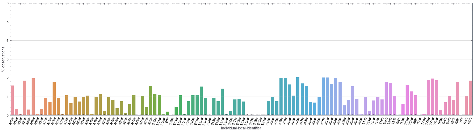
In the figure above, we can see that the frequency of observations (sampling size) across different vultures is pretty even. Although there are differences of roughly ~1% across difference vultures, the sampling is not dominated by one or a group of vultures.
Data Distribution
In this section, we look more in detail at the distribution of different attributes. Studying these attributes might help us understand if there are any systematic trends or biases in the data. It also helps us better understand the attributes from the dataset, thus facilitating feature selection too.
First, we define a reusable function to plot a distribution for each attribute:
1
2
3
4
5
6
7
8
9
10
11
12
13
14
15
16
17
18
19
20
21
22
23
24
25
26
# define an auxiliary function to draw several plots in a tight layout
def plot_distributon(
    cols,
    stat='count',
    bins=100,
    log_transformation=False,
):
    plt.figure(figsize=(25, 7))
    sns.set(font_scale=2)
    for i, feature in enumerate(cols):
        ax = plt.subplot(1, len(cols), i+1)
        if log_transformation:
            sns.histplot(
                data=df_ornitela[cols],
                x=feature,
                stat=stat,
                bins=bins,
                log_scale=(False,True)
            )
        else:
            sns.histplot(
                data=df_ornitela[cols],
                x=feature,
                stat=stat,
                bins=bins,
            )
Location
We explore the probability distribution of latitude and longitude. This is important because the INPA only operates in Israel, therefore we wouldn’t like the dataset to contain many griffon vultures that flew away from the area.
1
2
3
4
5
6
7
8
9
10
11
12
13
14
15
16
17
18
19
20
21
22
23
loc_cols = ['location-long', 'location-lat']
df_ornitela[loc_cols].describe().apply(lambda s: s.apply('{0:.5f}'.format))

ISRAEL_LAT_RANGE = (29.55805, 33.20733)
ISRAEL_LONG_RANGE = (34.57149, 35.57212)

# plot lat and long  distribution
fig, axs  = plt.subplots(1,2, figsize=(25, 7))
sns.set(font_scale=2)

for i, col in enumerate(loc_cols):
    sns.histplot(
        data=df_ornitela,
        x=col,
        bins=25,
        stat='probability',
        ax=axs[i]
    )
    axs[0].axvline(ISRAEL_LONG_RANGE[i], color=COLORS[1], linewidth=2)
    axs[1].axvline(ISRAEL_LAT_RANGE[i], color=COLORS[1], linewidth=2)

plt.tight_layout()
plt.show()
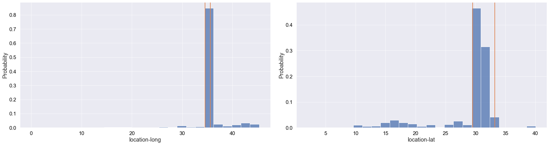
Although some griffon vultures flew out of Israel, we can see that the vast majority of records occurred in Israel.
In the future, we could have a more fine-grained analysis to potentially improve the performance of an ML model. This would mainly involve getting rid of events that didn’t occur in the Negev desert in Israel, where INPA focuses their conversation efforts.
Height
Height might be a potential telling feature as outliers might correspond to a death related event, although change in height for a particular vulture would be more telling (this might be encoded in acceleration). Let’s plot the probability distribution of height:
1
2
3
4
5
6
7
8
9
10
11
12
13
14
15
16
plt.figure(figsize=(14,7))
sns.histplot(
    data=df_ornitela,
    x=df_ornitela['height-above-msl'],
    stat='probability',
    bins=80
)

plt.axvline(
    df_ornitela['height-above-msl'].median(),
    color=COLORS[1],
    label=f"median = {df_ornitela['height-above-msl'].median()} m"
)
plt.legend(loc=0, prop={'size': 20})
plt.xlim(-500,3000)
plt.show()
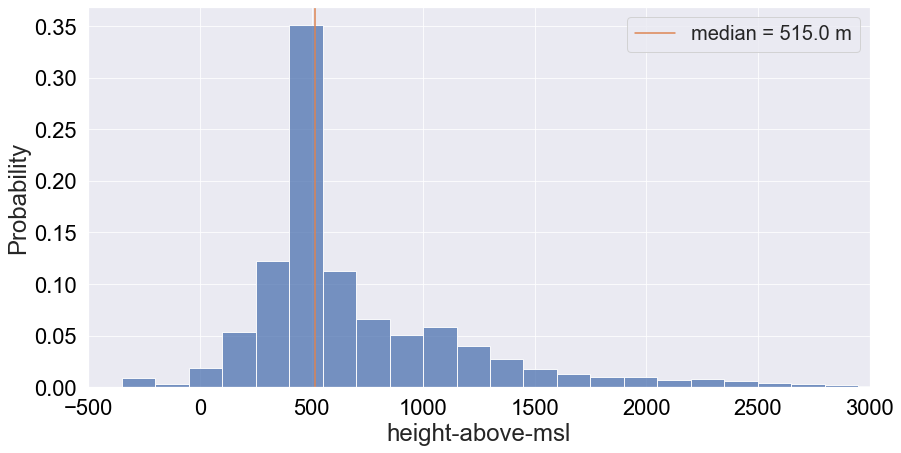
We get a tail-end distribution with a median altitude of roughly 515m. This reflects the known fact that griffon vultures tend to stick around higher altitudes. We will also print the percentile distribution for reference:
Ground Speed
Ground speeds will tend to be very specific decimal numbers. Therefore, the challenge with looking at its distritbution is that it’ll be very sparse. To make up for this sparness, we can bin the data and plot the probability distribution:
1
2
3
4
5
6
7
8
9
plt.figure(figsize=(14,7))
sns.histplot(
    data=df_ornitela,
    x=df_ornitela['ground-speed'],
    stat='probability',
    bins=75,
)
plt.xlim([0, 200])
plt.show()
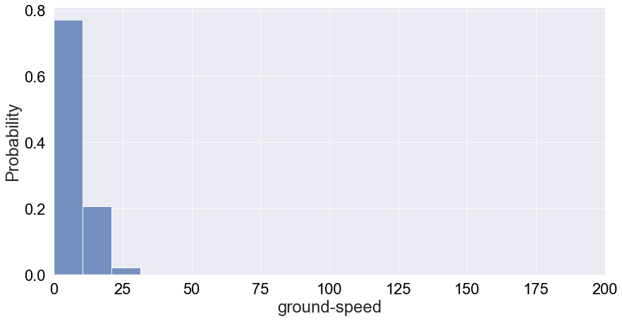
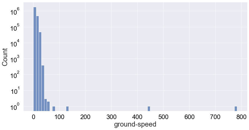
We see that it’s very much a tail-end distribution with the tail just around 25m/s. Therefore, most likely the speed of a vulture will be below 20 m/s. However, there’s some interesting behaviour at play. We binned the data in 75 bins but we can only see 3 in the plot above. I did bound the x-axis between speeds of 0 to 200, but still this doesn’t really explain all the missing bins. Let’e see if a log-plot of the count distribution without x-axis boundaries can give us any insights:
1
2
3
4
5
6
7
8
9
plt.figure(figsize=(14,7))
sns.histplot(
    data=df_ornitela[df_ornitela['ground-speed']>40],
    x=df_ornitela['ground-speed'],
    stat='count',
    bins=75,
    log_scale=(False,True),
)
plt.show()
1
df_ornitela[['ground-speed']].describe().apply(lambda s: s.apply('{0:.5f}'.format))
| ground-speed | |
|---|---|
| count | 2374006.00000 |
| mean | 4.39986 |
| std | 6.77396 |
| min | 0.00000 |
| 25% | 0.00000 |
| 50% | 0.27778 |
| 75% | 9.44444 |
| max | 783.33333 |
Now we can see a few outliers with ground-speed values of slightly more than 400 [m/s] and slightly less than 800 [m/s]. This seems excesively large ground speeds for Griffon vultures, and it still so it must a malfunctioning of the tracking device.
The summary statistics also doesn’t seem to indicate why we see these behaviour with missing bins. Let’s try to filter the dataset for speed values less than 80 m/s and replot the probability distribution of speed:
1
2
3
4
5
6
7
8
9
10
11
12
13
14
15
16
df_ornitela_filtered = df_ornitela[df_ornitela['ground-speed'] < 80]
print(
    f"Number of records where vultures are moving at speeds greater than 80m/s:",
    f"{1 - (len(df_ornitela_filtered)/len(df_ornitela)):.2e}"
)
print("="*100)

plt.figure(figsize=(14,7))
sns.histplot(
    data=df_ornitela_filtered,
    x=df_ornitela_filtered['ground-speed'],
    stat='probability',
    bins=100,
)
plt.xlim([0, 25])
plt.show()
1
2
Number of records where vultures are moving at speeds greater than 80m/s: 1.68e-06
====================================================================================================
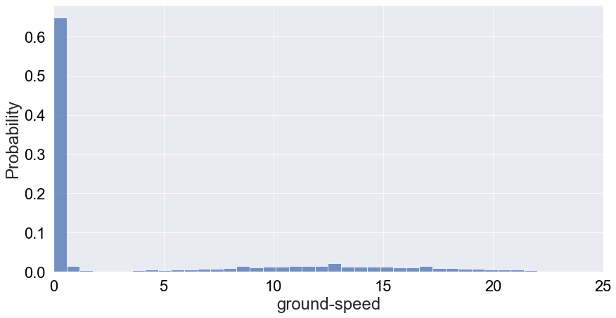
This distribution is a much more telling picture of speed. It tells us that vultures are most likely to be static or moving at speeds below 2 m/s, which probably means they’re moving on the ground. Moving forward, we probably want to implement this filter in our dataset unless those outliers really represent dying vultures according to experts. In any case, these only represent 1.5 million of a fraction of the Ornitela sample.
Acceleration
Now we take a look at a very interesting attribute: acceleration which is measured in the 3 dimensional x-, y- and z-xis. First, let’s have an overall look at the desntiy distribution for acceleration in each direction:
1
2
3
4
5
6
7
8
9
cols_acceleration = [
    'acceleration-raw-x',
    'acceleration-raw-y',
    'acceleration-raw-z'
]

plot_distributon(cols_acceleration, stat='density', bins=120)
plt.tight_layout()
plt.show()
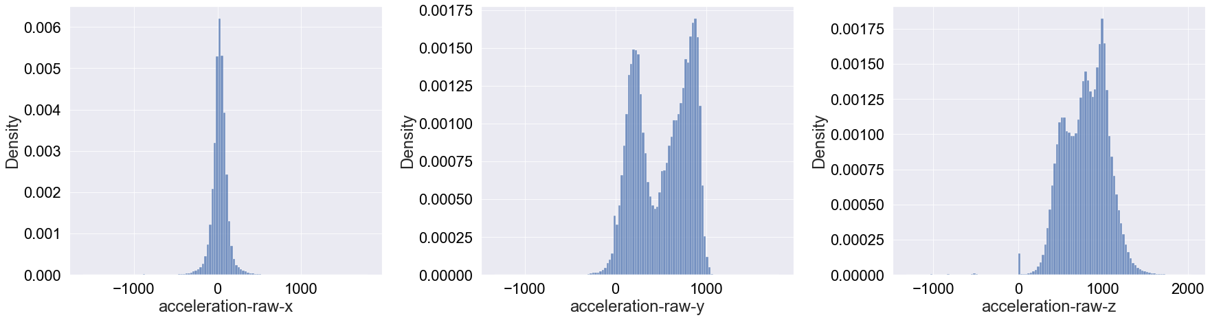
These a very interesting and diverse distributions! Going through each one (left to right above):
x-axis: It appears that the acceleration in this axis is mainly Gaussianly distributed around 0. Compared to the other directions, it’s surprising how symmatricaly distributed the acceleration is.
y-axis: This deviates more from a Gaussian shape, though one could argue it resembles a multi-modal Gaussian distribution. The surprising remark of this distribution is that the acceleration values are overall positive as opposed to the acceleration in the x-axis.
z-axis: Finally, the acceleration in the z-axis has a Gaussian-like shape without a defined peak. Again, we see that there are no negative acceleration values in this direction (except for a tiny bump around
acceleration-raw-z= -500).
Moving to interpreting these results, first one should note that griffon vulture are gliders, meaning that they minimise flapping and aim to optimise air currents. This might explain why the x-axis acceleration is distributed around 0. That is, if the wind is moves at constant speeds (not direction) and the amount of flapping is minimal, the values around 0 will correspond to fluctuations in the wind speed that are not significant. This gliding might also explain why most acceleration values in the y- and z- directions are negative. Mainly, it is unlikely that the wind will decelerate vultures sideways in a significant manner and as glidders, they make good use of convective air currents to move upwards.
To see if we can unpack more insights, let’s plot the three density distributions in a log-scale:
1
2
3
4
5
6
7
8
# plot with log transformation on the y-axis
plot_distributon(
    cols_acceleration,
    stat='density',
    bins=120,
    log_transformation=True
)
plt.tight_layout()
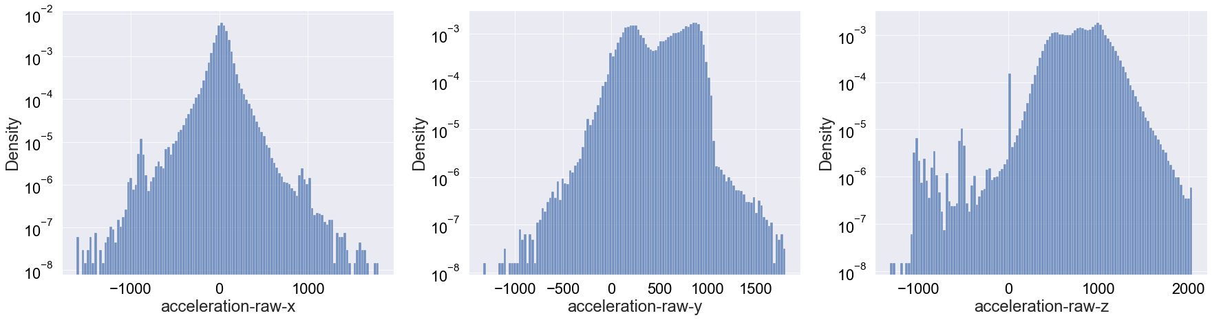
Apart from really highlighting the bump at 0 for the z-axis accleration, I don’t think this log-scale distributions are very telling. We will also print the summary statistics for reference:
1
df_ornitela[cols_acceleration].describe().apply(lambda s: s.apply('{0:.5f}'.format))
| acceleration-raw-x | acceleration-raw-y | acceleration-raw-z | |
|---|---|---|---|
| count | 2374006.00000 | 2374006.00000 | 2374006.00000 |
| mean | 25.38844 | 519.36946 | 800.00706 |
| std | 101.53411 | 301.16978 | 259.57626 |
| min | -1606.00000 | -1329.00000 | -1315.00000 |
| 25% | -17.00000 | 234.00000 | 604.00000 |
| 50% | 27.00000 | 568.00000 | 817.00000 |
| 75% | 73.00000 | 799.00000 | 992.00000 |
| max | 1798.00000 | 1810.00000 | 2040.00000 |
Pressure
Let’s have a look at the distribution of pressure as measured by barometric height (see more details here)
1
2
3
4
5
6
7
plt.figure(figsize=(14,7))
sns.histplot(
    data=df_ornitela,
    x=df_ornitela['bar:barometric-height'],
    bins=80,
)
plt.show()
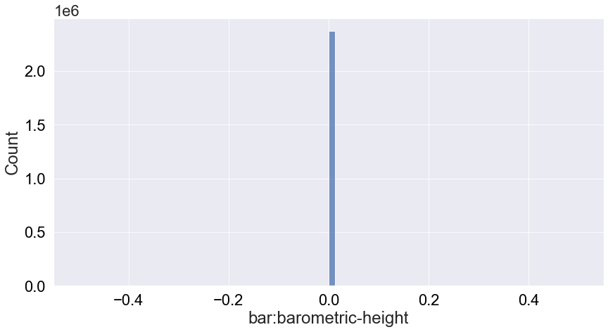
We see that the pressure is not very informative because it’s always 0 so we will ignore this attribute from the analysis.
Satellite Count
This counts how many satellites is used to produced each record. Plotting the count distribution:
1
2
3
4
5
6
7
8
9
10
11
12
13
plt.figure(figsize=(14,7))
sns.histplot(
    data=df_ornitela,
    x=df_ornitela['gps:satellite-count'],
    bins=15,
)
plt.axvline(
    df_ornitela['gps:satellite-count'].median(),
    color=COLORS[1],
    label=f"median = {df_ornitela['gps:satellite-count'].median()}",
)
plt.legend(loc=0, prop={'size': 20})
plt.show()
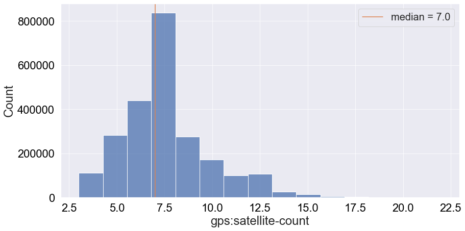
We can see that most frequently around 7 satellites are used to produce a data entry. However, this attribute might not be critical for the first version of an ML algorithm.
Temperature
Now let’s look at another very interesting attritbute: temperature. Assuming this corresponds to the temperature of the vulture, this can be a very good proxy for a death event. Especially if we look at the history of low temperature events associated with death, we might be able to distinguish between different types of death: lead poisoning, collision or hunting for example. Plotting the distribution of temperature:
1
2
3
4
5
6
7
8
9
10
11
12
13
14
plt.figure(figsize=(14,7))
sns.histplot(
    data=df_ornitela,
    x=df_ornitela['external-temperature'],
    stat='percent',
    bins=50,
)
plt.axvline(
    df_ornitela['external-temperature'].median(),
    color=COLORS[1],
    label=f"median = {df_ornitela['external-temperature'].median()} ˚C"
)
plt.legend(loc=0, prop={'size': 12})
plt.show()
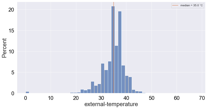
Interestingly, there are quite a few low temperature values and a bump around 0 (around 1%). Given that death is a rare event, the latter is an outlier that may be hidden by the abundance of values around 35˙C. Let’s see if the logged-scale count distribution can resolve that:
1
2
3
4
5
6
7
8
9
# Logarithmic transformation on the y-axis
plt.figure(figsize=(14,7))
sns.histplot(
    data=df_ornitela,
    x=df_ornitela['external-temperature'],
    stat='percent',
    bins=50,
    log_scale=(False,True),
)
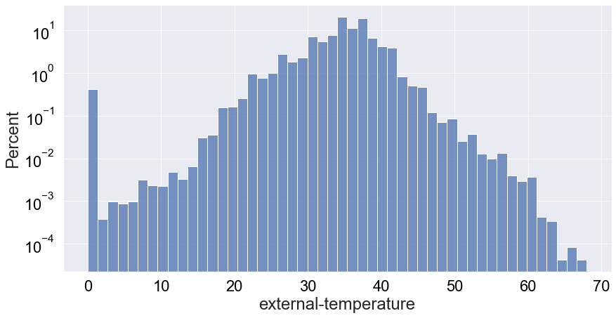
When looking at at the plot above, now we really see the highlighted bump around 0 as a very interesting outlier, corresponding to more than 1,000 records of dead vultures.
Correlation Overview
Scatter Matrix Plot
Finally, a scatter matrix plot allows us to see if there are any correlations between numerical features, which will feed into feature selection. If there’s a strong correlation (or various) between two attributes, this will tell us that one of the features is redundant to feed into an ML model.
Since plotting a scatter matrix is very computationally demanding, I’ll subsample the data set:
1
2
3
4
5
6
7
8
9
10
11
12
13
14
15
16
17
18
19
# extract numerical cols of interest
num_cols = [
    #'location-long',
    #'location-lat',
    'acceleration-raw-x',
    'acceleration-raw-y',
    'acceleration-raw-z',
    'ground-speed',
    'external-temperature',
    'height-above-msl',
]

df_num = df_ornitela[num_cols].sample(len(df_ornitela)//10)
g = sns.pairplot(df_num)
for ax in g.axes.flatten():
    ax.set_xlabel(ax.get_xlabel(), rotation = 90)                           # rotate x axis labels
    ax.set_ylabel(ax.get_ylabel(), rotation = 0)                            # rotate y axis labels
    ax.yaxis.get_label().set_horizontalalignment('right')                   # set y labels alignment
plt.tight_layout()
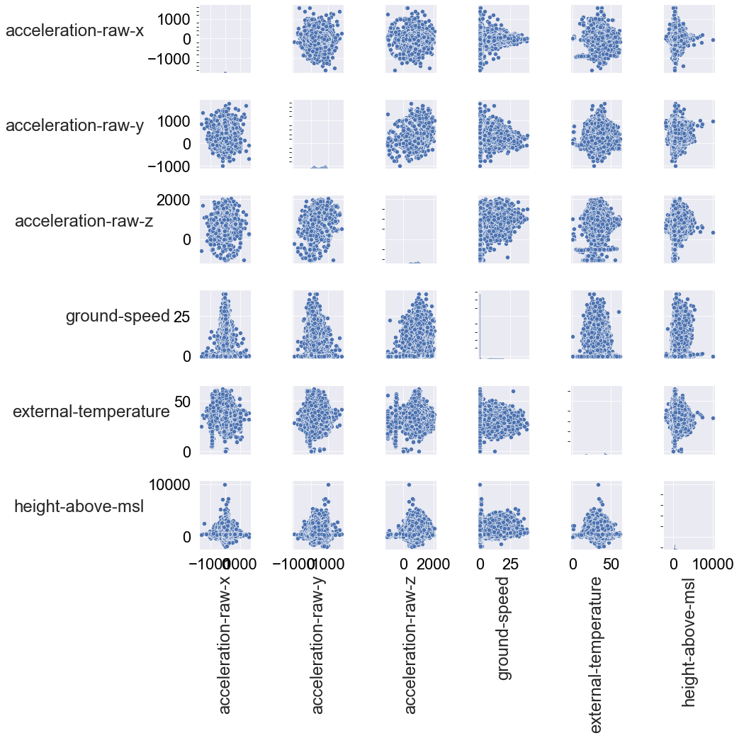
There are no obvious correlations at first glance. We can note however that the deviation of the scatter is quite great and that we see quite a lot of clustering between the attributes. In any case, we don’t have to remove attributes due to correlations.
Conclusion
In this post, we performed an Exploratory Data Analysis (EDA) on the Ornitela dataset, which enables with a better understanding on how the dataset is characterised. Moreover, it gave us an overview of what attributes of the dataset are most important for developing an ML algorithm that can predict a likelihood of high-risk of death based on the attributes (e.g., latitude, longitude, speed, etc).
From a causal inference perspective, I think the most important attributes for the first version of an ML algorithm are the following:
event-idindividual-local-identifiertimestamplocation-longlocation-latheight-above-mslground-speedacceleration-raw-xacceleration-raw-yacceleration-raw-zexternal-temperature
Once we have done a first feature selection, we can go ahead and prepare the dataset to be fed into an ML model. Stay tuned for the next steps!